Responsive design refers to the ability of our website to adapt to various screen sizes remaining the same user-friendly whether we visit it from a computer or a mobile phone.
Nowadays most websites take this parameter into consideration as they are purpose built to be visited by various devices which may have different screen dimensions, i.e. by a mobile phone up to a computer.
Although it is taken for granted that the website is built to these specifications it's useful for a website owner to be able to do a quick check on it about how his/her website looks on a mobile or a computer or even a tablet screen.
He could of course visit his/her website from a mobile phone if he/she wants to see how it looks on a mobile phone or
from a computer if he/she wants to see how his/her website looks on a computer.
This approach is partially correct, but it is good to ask ourselves here, are all mobile screens the same size or not?
All computers have the same screen size?
The answer is no, as every mobile screen is different just like every computer screen so we definitely can't buy
all mobiles in the world or all computer screens to see how our website looks on them.
We want a more useful tool for this job.
Is there such a tool and indeed free and accessible to anyone?
Yes there is and that is why we are writing this article.
But what equipment do I need to check how my website looks on different screen sizes.
-A computer
-Internet Connection
-Web Browser.
Below follows four short asterisked notes before the article continues.
*Here it is good to mention that there is the possibility to carry out the check that we will describe below from a mobile phone but this is not suitable for this job since the mobile screen is too small for simulations.
*Internet connection is optional if the website is located locally on our computer though because that's something which requires technical training we will not mention it at all.
* At this point it is good to mention that the whole process is a part of controlling how the website behaves on different screen sizes. For a complete check we must additionally follow an additional procedure concerning the cross browser compatibility (could be discussed in a later article).
Step One
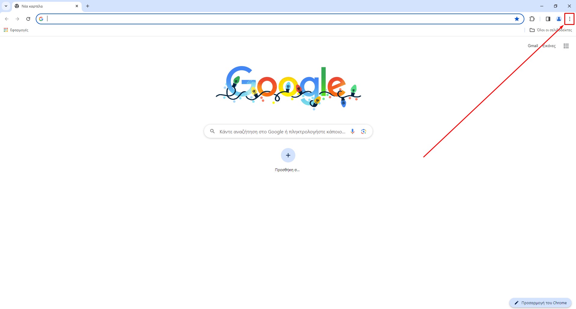
Open google chrome (see picture )

Step Two
Select the three vertical dots on the top right (see image)

Step Three
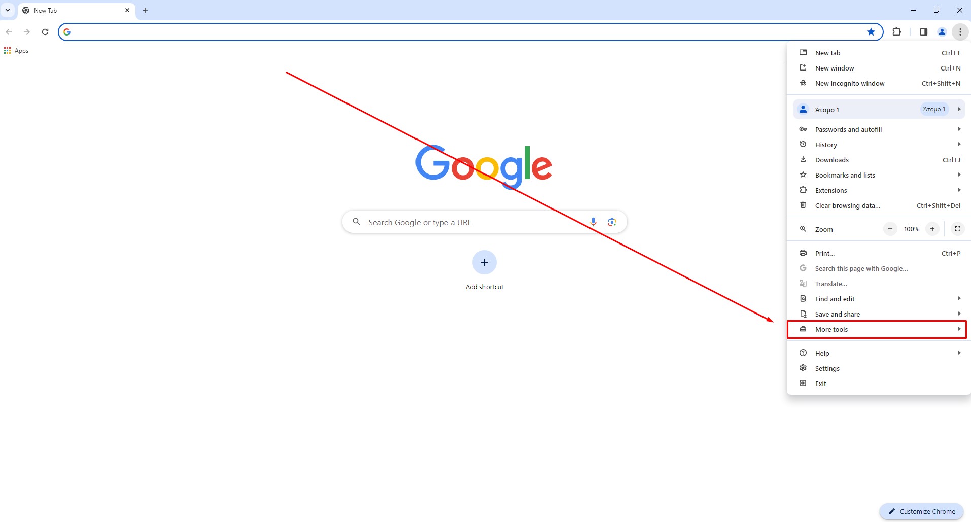
We select from the menu the option 'More tools'

Step Four
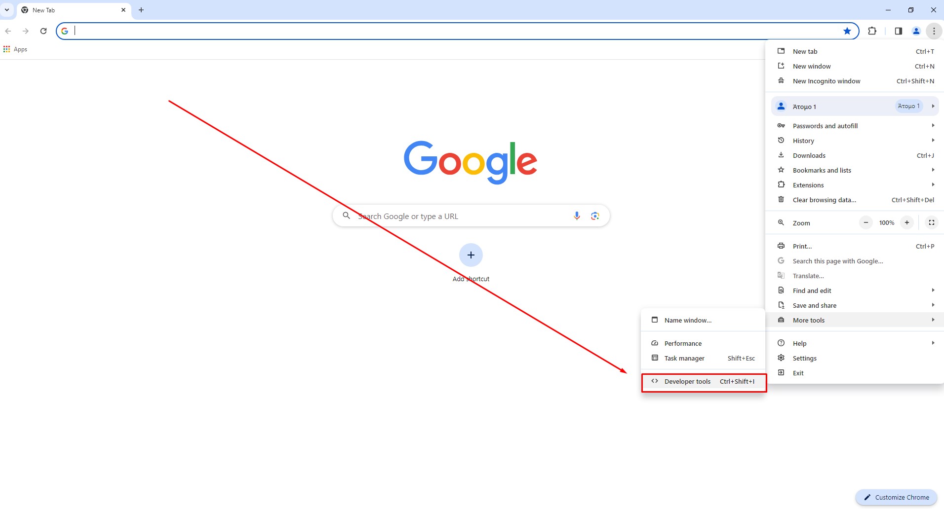
We select from the submenu the option 'Developer tools'

Step Five
We choose from the icon at the bottom left
Step Six
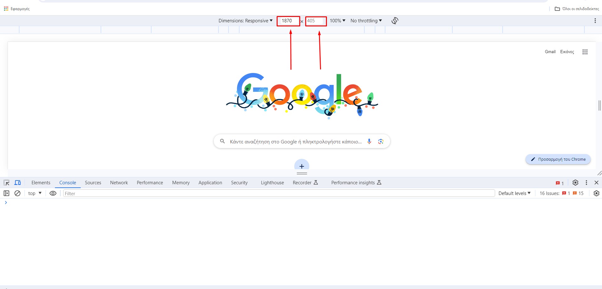
Having now entered the environment that allows us to make the screen size control we can zoom in or out the screen by pressing and simultaneously dragging the icon with the two vertical lines left or right as shown in the image.
Step Seven
An alternative way in step 6 to affect the screen size is to modify the width and the height of the screen manually. The way we can do that is by clicking on one of the two boxes shown in the image and give our values. The left refers to the width of the screen and the right to the height of the screen (the unit of measurement is pixels).

*********************************
Practical Exercise
Visit your favorite website and apply the steps we described above to see how the website behave when the screen size changes.
***************************
*
If you have any question about the article feel free to contact with me.
It is my pleasure to interact with the readers and learn what they understand or what they dont understand.
This way i can improve or simplify the article if i notice readers dont understand a specific point so it acts like feedback
and this way you help yourselfs and at the same time you help the others since you help me to improve the article.
So you are 100% encouraged to do that!
Communication Methods
Email: bertiosgiorgos@yahoo.com
Facebook: Giorgos Bertios - Κατασκευή Ιστοσελίδων
Thank you so much for taking time to read my article!
George Bertios